Visualizing a Microsoft Azure Cosmos DB
Gain insights about your CosmosDB relationships through diagram visualizations
Microsoft Azure Cosmos DB (also called CosmosDB) is a distributed cloud database that stores data in various data models like key-value, column-family, document, or graph model. The graph data model is particularly suited for relationship-focused data since it uses a collection of nodes and edges with associated properties to store data.
In contrast to table-based, or relational databases, graph databases can handle vast amounts of connected data more efficiently because only locally connected parts of the database need to be considered when running queries on the database. This approach makes them particularly useful in big data analysis.
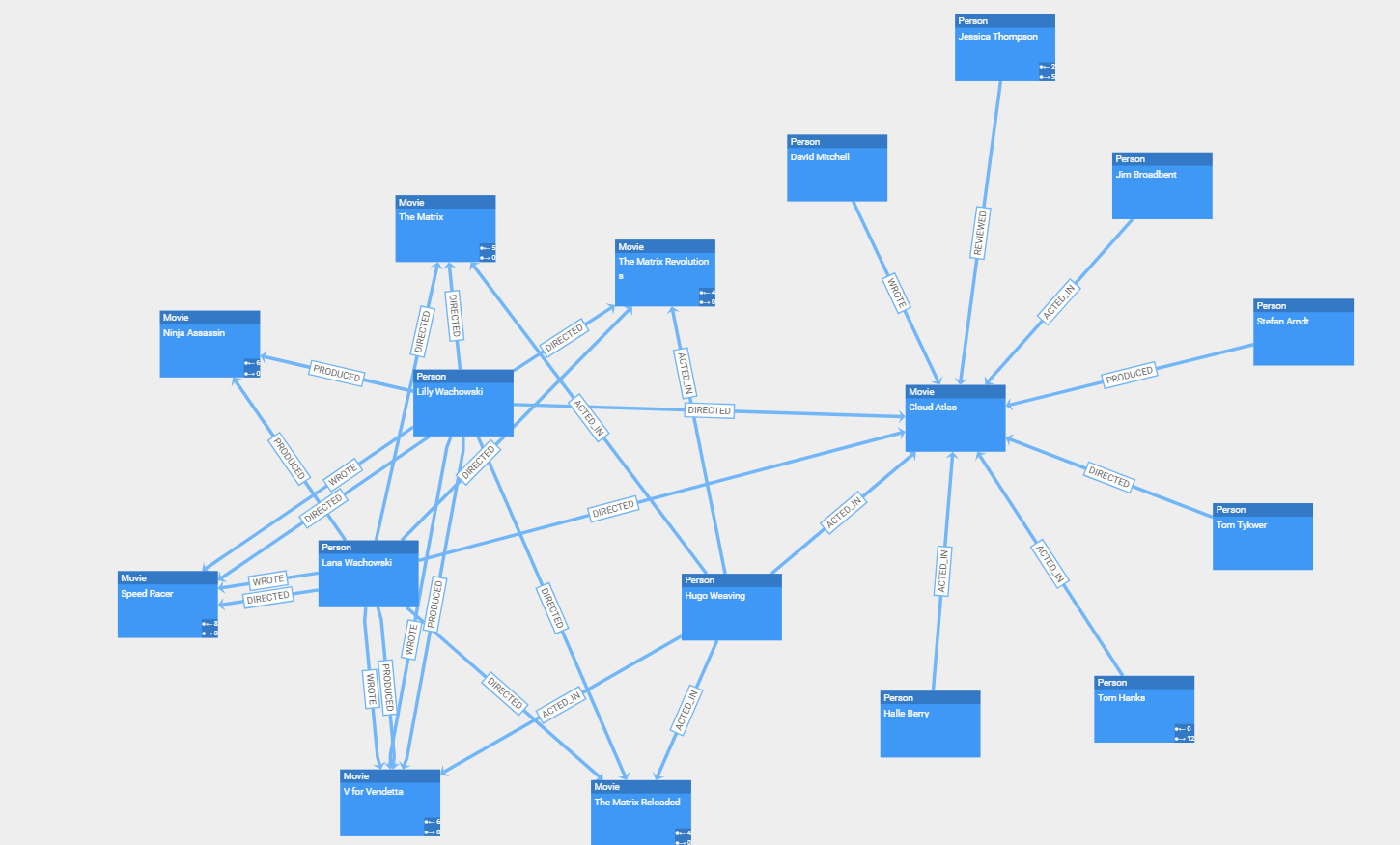
The graph data model’s focus on connectivity makes it particularly suitable for a network-like visualization, enabling non-technical users to explore and interact with the stored data easily.
Why Use a Graphical Representation of a CosmosDB?
CosmosDB can be queried for data using Gremlin, an efficient graph traversal language. The user can query the database for the stored entities and use the relationships to traverse the connected neighborhood. This approach requires in-depth technical knowledge of the database itself and also the query language Gremlin to explore the stored data.
A visualization enables users to visually explore the data, identify significant structures, and get a better understanding of relationships. Besides the visual exploration, it is also possible to interactively edit the stored data by modifying the diagram without any knowledge of the associated query language like Gremlin.
Therefore, being able to provide a high-quality visualization of the CosmosDB could be a powerful solution when handling or analyzing vast amounts of data.
Challenges of Graph Database Visualizations
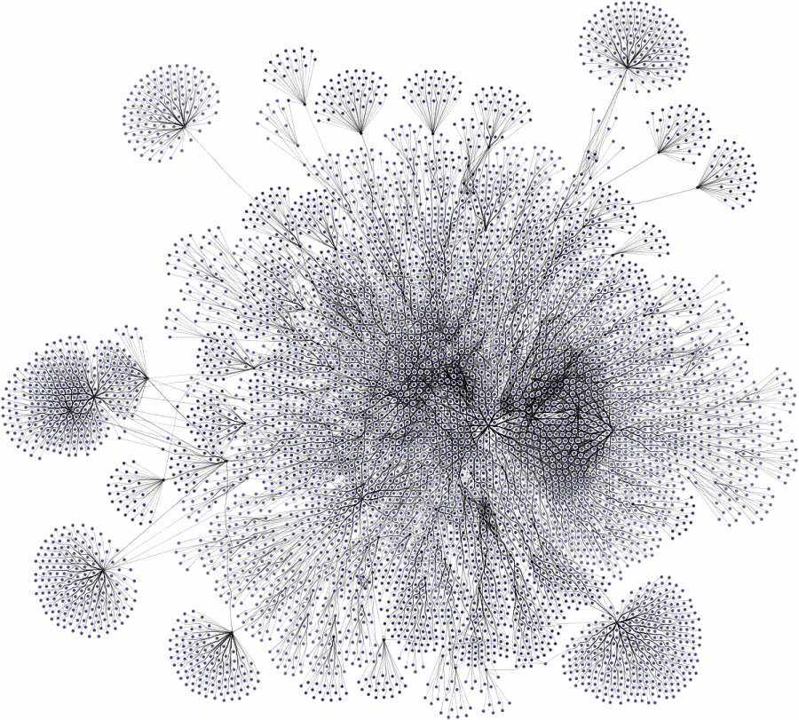
Although the nature of the connected graph data is predestined for visualization, it is still a challenging task because of the sheer amount of data that it usually contains.
The first step in presenting the data is to query it from the database. After that, the query result must be arranged meaningfully to create a human-readable representation of the raw data. Additionally, a styling that differentiates the different types of entities and relations and presents the properties associated with the items helps to interpret the data at a glance. Furthermore, the performance should allow for an interactive exploration of the data.
Creating a Graph Visualization From CosmosDB Data
CosmosDB comes with a built-in Data Explorer in the Azure portal that also provides a ‘Graph’ pane, which displays the queried data in a network-like fashion. This explorer lets you zoom in and out of the diagram, move items in the chart and also add new entities while further panels display detailed information for the entities.
While this can be sufficient for many data sets, there exist many more complex use cases that either require specific interactions (e.g., drill-down, merging, filtering) or in which specific arrangements have to be applied to identify certain substructures in the data.
Also the viewer in the Azure portal is targeting software developers and database administrators. If you want to create highly interactive applications that help your possibly non-technical end-users work with the data stored in the data base, creating a custom solution is the better option.
Utilizing a Sophisticated Visualization Solution
A comprehensive visualization solution provides a means to create a client app that enables users to gain more insight into the stored data. It can be tailored to specific requirements related to element visualization, element arrangement, or interactions.
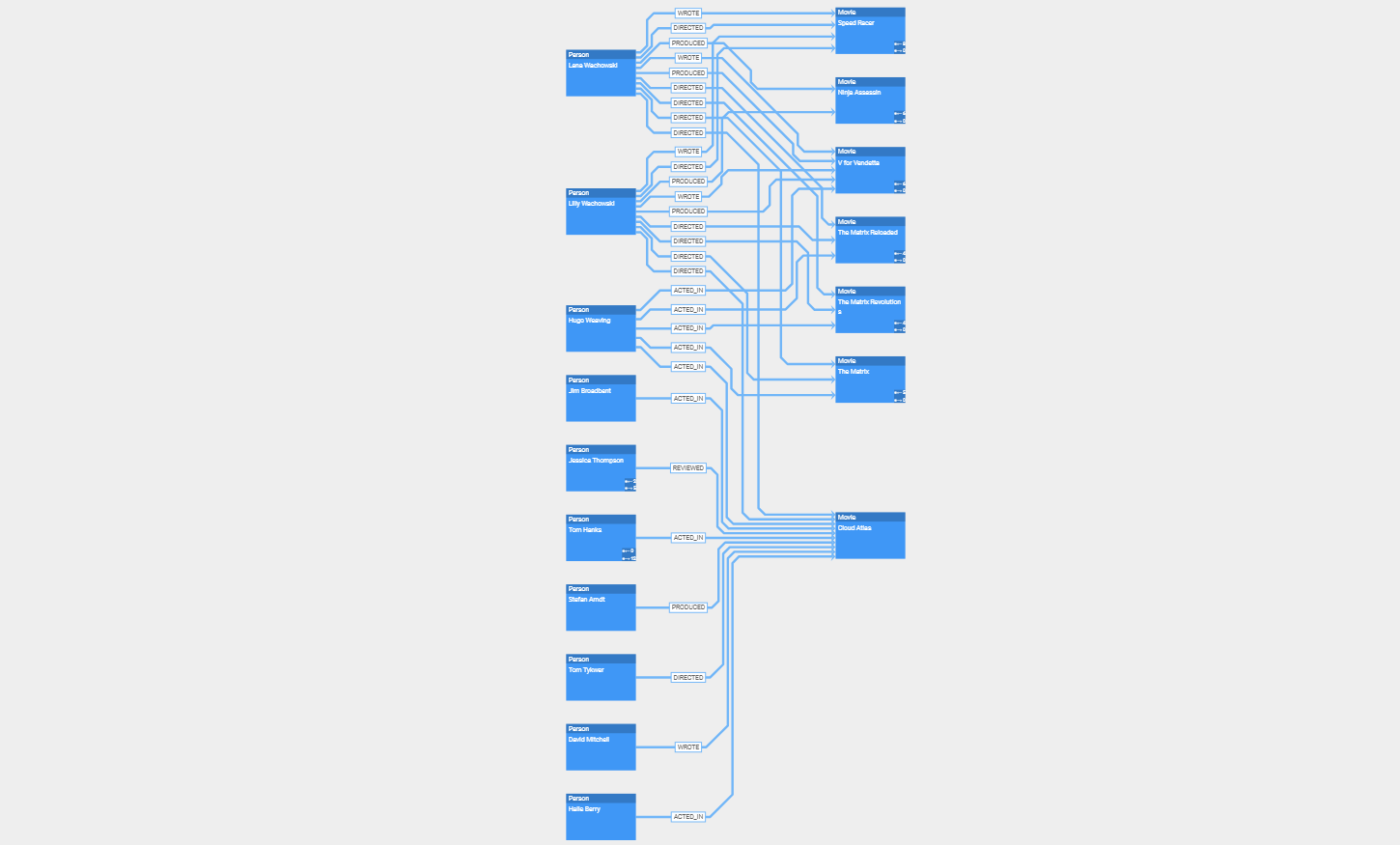
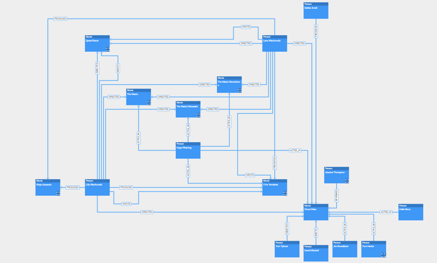
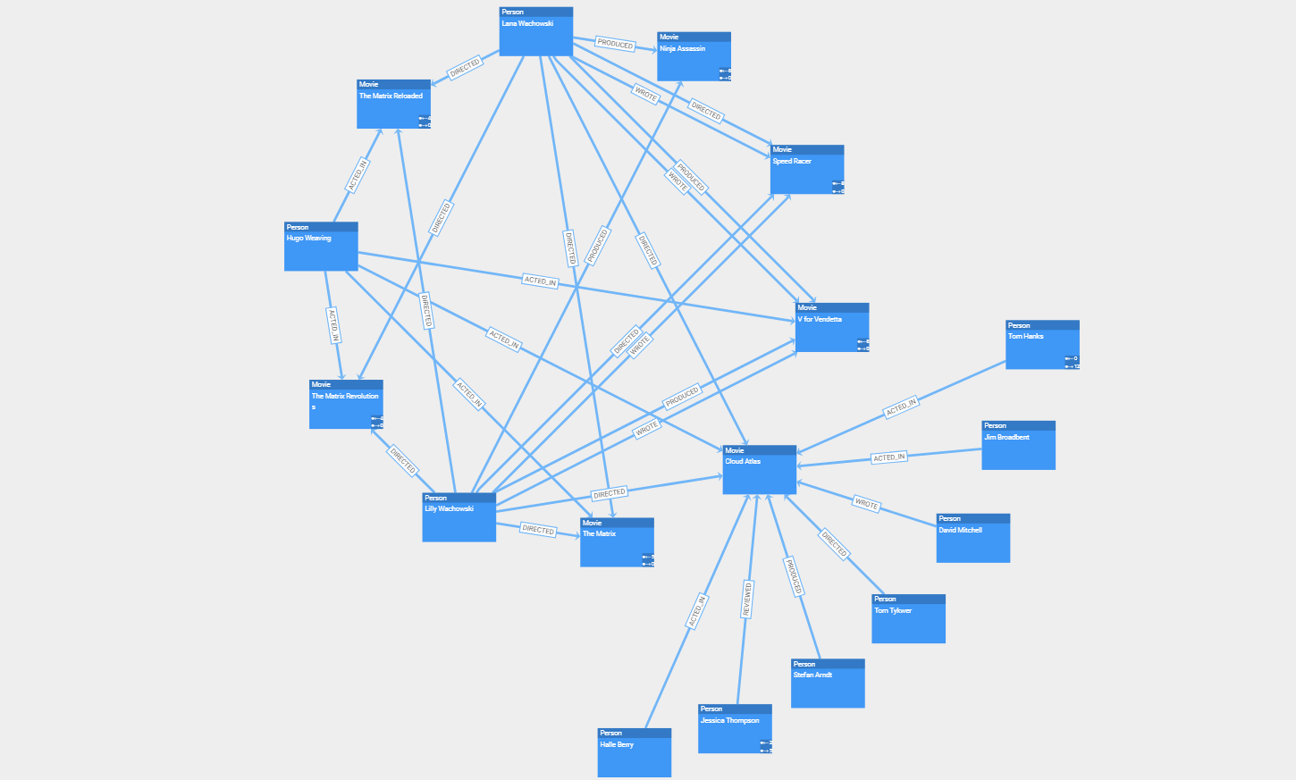
yFiles for HTML is a commercial programming library explicitly designed for diagram visualization and is a perfect fit for the challenges of graph database visualization. Its sophisticated layout algorithms can easily transform the data in a readable, pleasing, and informative network. The different layout styles, for example, hierarchic, organic, tree, circular, or radial, enable the user to intuitively identify structural characteristics of the data, such as hierarchy, connected components, or rings.
Furthermore, yFiles for HTML comes with a multiplicity of graph analysis algorithms (e.g., centrality, clustering, path algorithms, etc.) that can be applied to the data model to add more value to the data.
The rich interaction possibilities and animation support make it possible to create engaging applications.
Connecting yFiles for HTML to CosmosDB
CosmosDB supports a variety of different APIs to access the data, among which Gremlin is often used to query the database. The result consists of JSON data objects with multiple properties that represent the stored entities.
A simple REST API endpoint can be implemented using whatever server technology you prefer to perform the graph queries. Sending the response to the client is all that is required for visualization:
yFiles for HTML comes with several Graph Builder utility classes, which transform the raw data from the result of a REST API query into a graph structure. After building the graph structure, the full power of the yFiles for HTML diagramming library is at your disposal.
Data-Driven Visualization
A good visualization provides insights into the data that are not obvious by looking at the raw data. yFiles for HTML offers several ways to use the data from the CosmosDB database to create a rich and meaningful representation. The user can take advantage of the powerful data binding capabilities to create item templates that utilize the labels and properties of the CosmosDB data.
Automatic Arrangement
Automatic layouts can give you different perspectives on your data structure. In particular, they make it easy to identify substructures in your data like connected components, chains, circles, stars, and hierarchies. yFiles provides an extensive set of sophisticated, highly configurable automatic layout algorithms that arrange your data in a clear, concise, and readable manner in the blink of an eye.
Powerful Exploration
An interactive application can provide much more functionality than a simple static representation. With yFiles, a graph visualization can be augmented with a considerable set of interactive features:
-
Grouping lets you combine similar or related items to reduce visual complexity
-
Drill down helps to explore specific parts of the data
-
Filtering can be used to reduce the number of displayed entities without any additional database queries
-
Data exploration and interactive modification is possible by mouse, keyboard and touch gestures
-
Animations can help to provide a pleasant user experience
Examples and Source Code
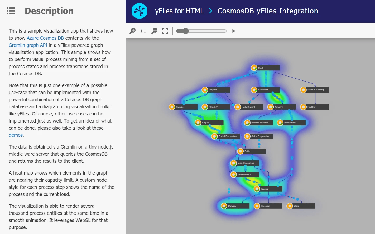
With yFiles, database visualization can be realized on all supported platforms. For yFiles for HTML there is a Cosmos DB Process Mining Example and a GraphQL Sample Application that show how to load data from a graph database via REST APIs and via a GraphQL service, respectively.
The source code of these sample applications is available on the yWorks GitHub repository:
