What’s growing in the graph garden?
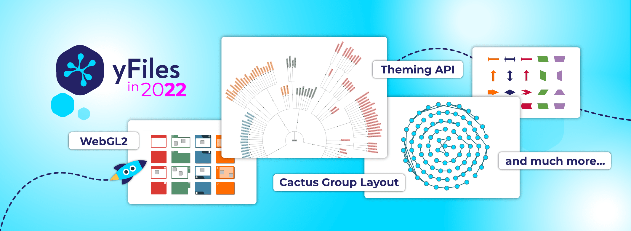
Our annual major release for yFiles is here – and includes lots of new options! Again this year, yFiles expands its palette of versatile, automatic layouts. One highlight is the new Cactus Group Layout, which lets you visualize groups with a strong emphasis on their grouping hierarchy, as well as the new Compact Disc Layout, which densely arranges nodes around a common center point.
And that’s not all! The upcoming release offers an array of fresh visualization options: an all-new flexible group node, arrow-shaped nodes and edges, and custom label shapes, just to name a few. When it comes to the look and feel of your application, the sky’s the limit.
We also worked hard to extend the WebGL2 rendering mode – from additional animations, to new highlight and selection effects, to greater visual fidelity and performance, to improvements in style persistence.
Throughout the SDK, we’ve refined many of the interaction elements, so yFiles will surprise you with plenty of small innovations, in terms of handling as well as design.
Creating beautiful, up-to-date graph applications is easier than ever!
Visualization and interaction
GroupNodeStyle
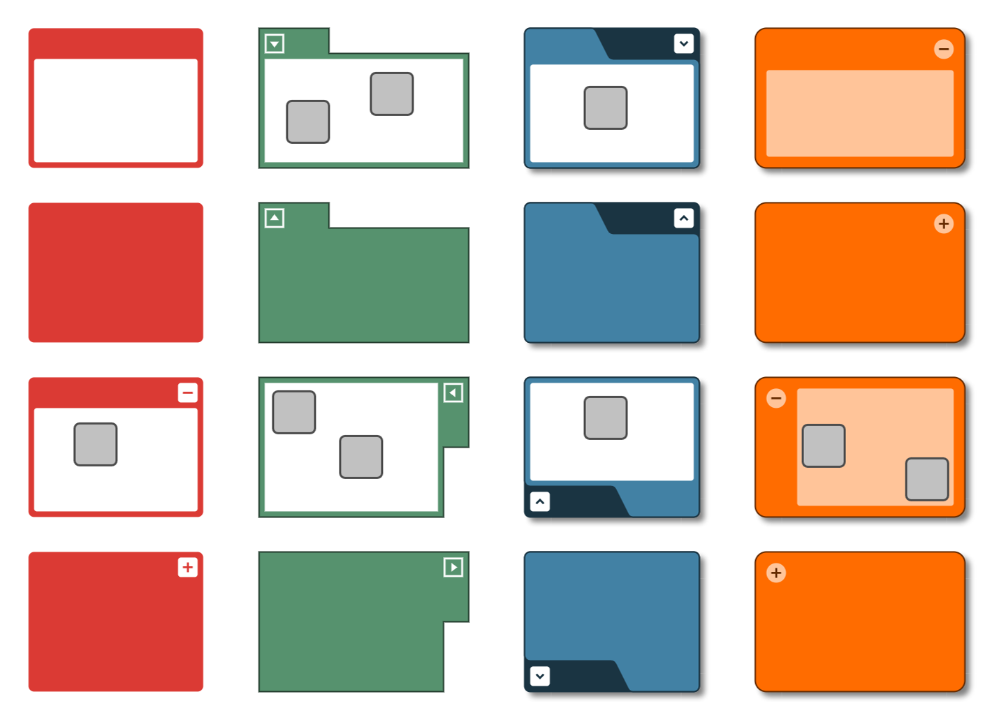
Displaying nested hierarchies has always been a major use case for yFiles. While yFiles has always supported grouping and folding, configuring the visual appearance of group and folder nodes is now much easier using the all-new flexible style for group nodes.
Since all visual aspects of the GroupNodeStyle can be adapted through an easy-to-use API, configuring the perfect grouping visualization for your application is now just a matter of minutes. This new node style even comes with a corresponding WebGL2 variant for those high-performance use cases!
GroupNodeStyle Demo
APIDeveloper’s Guide
Test and experience yFiles free of charge!

- Free support
- Fully functional
- 100+ source-code examples
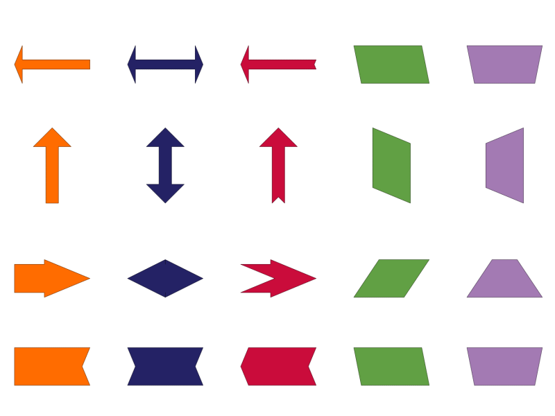
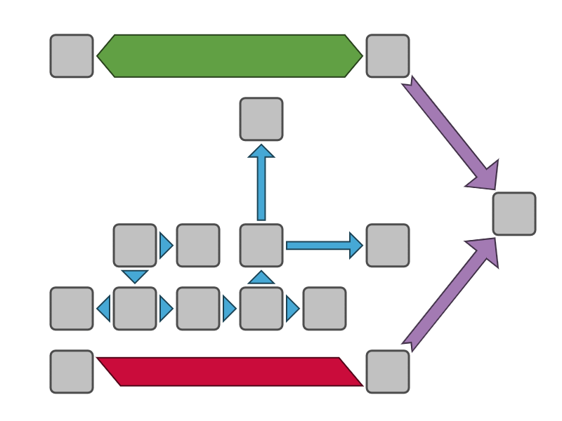
ArrowNodeStyle and ArrowEdgeStyle
We noticed that arrow-like shapes are a very popular with our customers. So far, users had to provide their own shapes and import them as styles. To support this frequent use case, we made these shapes more readily available for both nodes and edges – by adding the corresponding node and edge styles for arrow shapes to the library. For both styles, the actual arrow shape can be freely configured using e.g. the parameter that controls the arrow tip angle and the thickness of the shaft.
Rectangle Node Style
Of course, simple rectangles have always been supported as a node shape, but we noticed a demand for additional configuration options that allow for individual customization of all four rectangle corners. So, we added a specialized style for this purpose. You can play around with the configuration options in the sample application that demonstrates the new rectangle node style.
Label Shapes
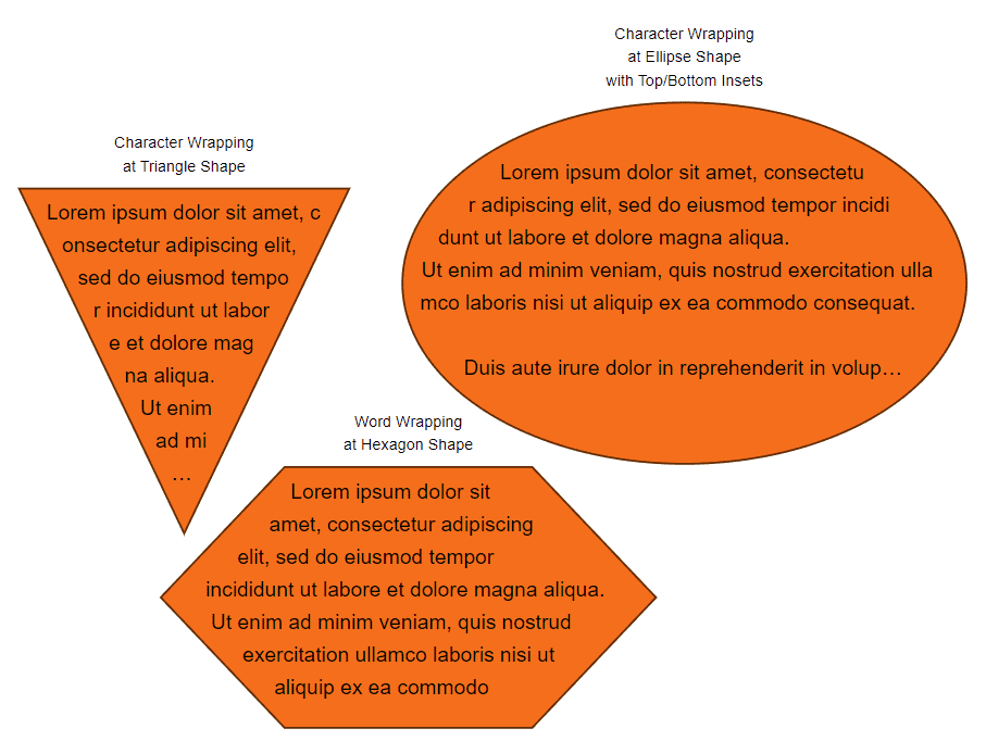
The default label style now supports additional shapes for the label background, out-of-the-box. The automatic text wrapping functionality also works with all supported label shapes. This lets you create beautiful visualizations with lots of text inside shapes: text that does not overflow and uses all of the available space!
Label Text Wrapping Demo
Default Label Style Demo
WebGL2 Animations
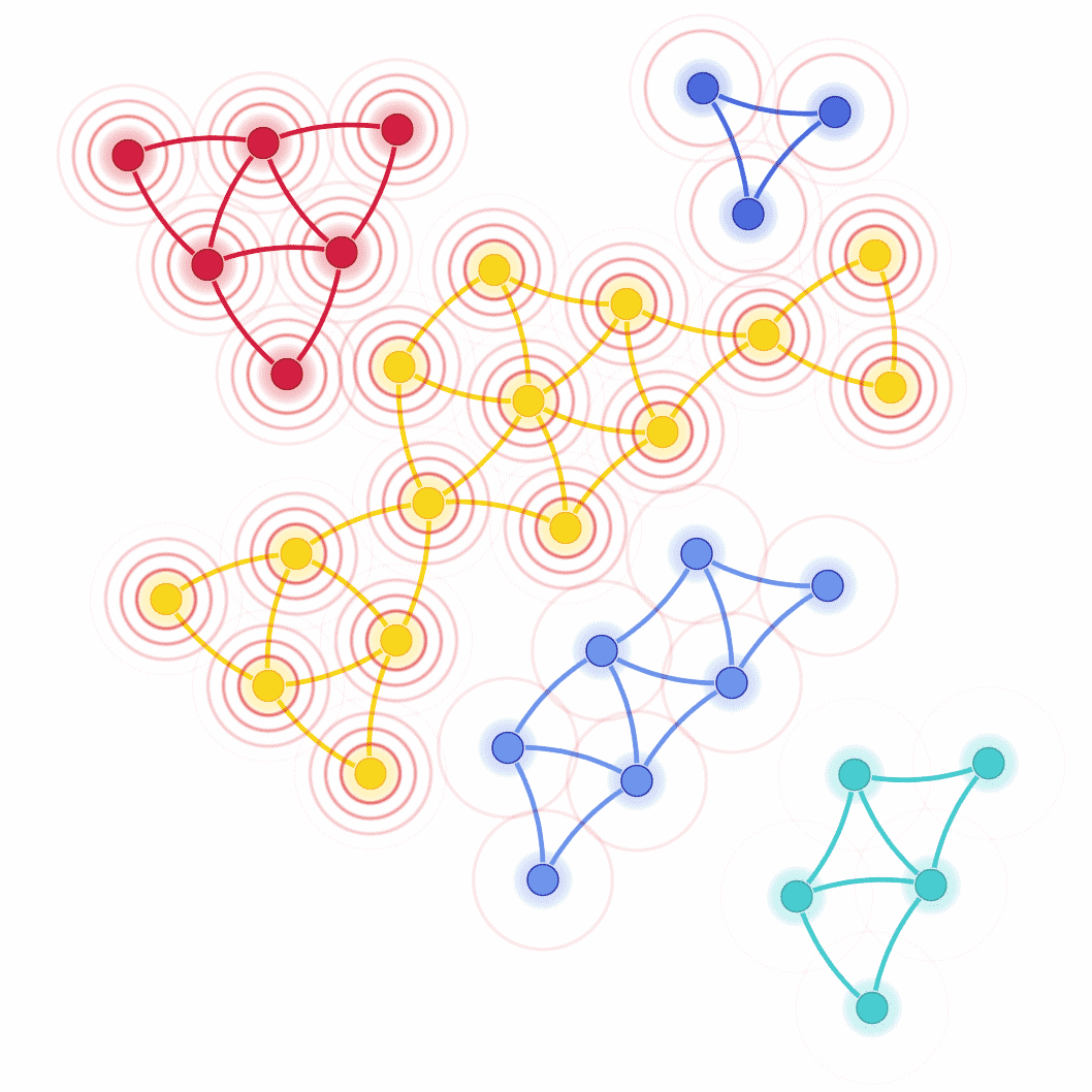
For the new release, the animation API was made more powerful and consistent to allow for full control over animation timing and properties. A new set of animations was added that can be used to beautifully highlight elements in the graph.
Theming and Scrollbars
If you’ve ever wondered how to adapt the “look and feel” of the diagramming component in your yFiles-enabled app, this just got much easier. The new Theming API determines the appearance of all the yFiles interaction elements. In addition to the classic theme, it comes with two new modern and clean-looking variants.
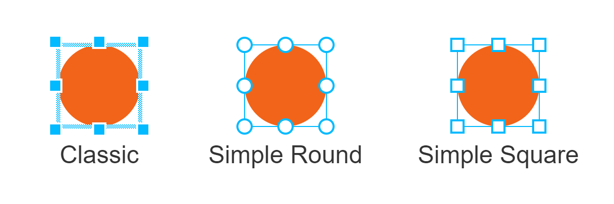
With the new Theming API, it’s now a breeze to consistently adapt the input elements to the design concept of your application, e.g. in order to match the colors of the corporate design.
While it is still possible to customize the individual input elements programmatically or using CSS, the general look can now be determined easily, using a theme consisting of the variant, colors, and scale.
graphComponent = new GraphComponent({
  theme: new Theme({
    variant: 'simple-round',
    scale: 2,
    primaryColor: 'white',
    secondaryColor: '#333',
    backgroundColor: 'gray'
  })
})
In addition to the Theming API, we also added a less obtrusive scrollbar variant for the yFiles graph component. When this variant is enabled, the scrollbars will only appear when hovered, or when the viewport changes. This allows for a less cluttered view of your beautiful yFiles graphs. The new scrollbar behavior should feel familiar, as it is widely used on touch devices and in modern operating systems.
New Selection, Focus, and Highlighting Options for WebGL2
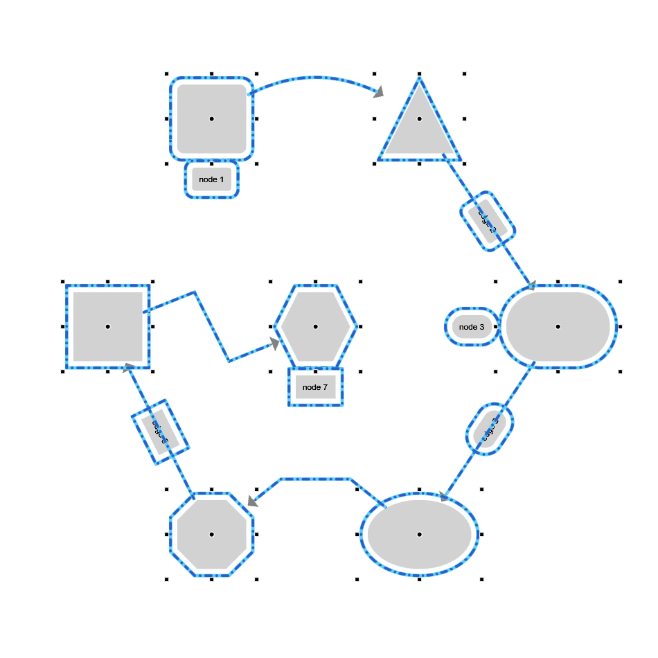
For your high-performance, large-graph use cases, yFiles for HTML 2.5 brings a completely new implementation for the visualization of selection, highlights, and the focus indicator in the WebGL2 rendering mode. Choose from a set of animated selection indicators with various rendering styles and use transitions to smoothly hide and reveal the selection indicators.
Improved support for asynchronicity of interactive operations
The node creation and edge creation callbacks for interactive graph item creation can now be implemented as asynchronous functions. This facilitates performing e.g. server requests or prompting for user input when graph items are created by the user.
Improved touch interaction
With the new scaling support of interaction theming, it’s now easier than ever to deliver a great UX for touch interactions. We’ve also added a configuration option that should make it more intuitive to edit graphs on touch devices. Instead of requiring the user to long-tap for edit gestures and quickly navigate with single finger swipes, you now use two-finger panning for the navigation and a single touch point for all the other gestures – as if you were using a mouse.
Developer Experience: Unified Typings
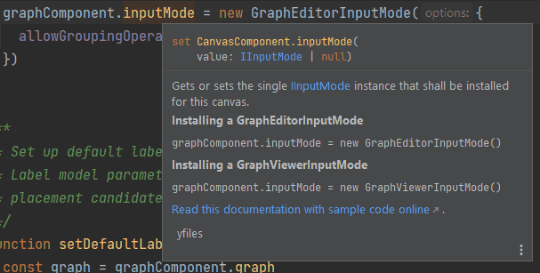
The yFiles library comes with comprehensive TypeScript typings that not only facilitate type-safe programming in TypeScript, but also enable coding assistance and quick documentation lookup in IDEs, vastly improving the development experience when programming with an extensive library like yFiles. Until recently, the most popular JavaScript IDEs VS Code and WebStorm supported conflicting formats of documentation comments in TypeScript typings. Therefore, we had to deliver separate typings for use with the individual IDEs, and developers had to make sure the suitable typings were used. Now, the typings documentation features supported by the IDEs have aligned sufficiently, so that the same, unified typings can be used for all major IDEs. This facilitates getting started with yFiles in your favorite IDE, where the appropriate documentation is right at your fingertips, along with sample code snippets and links to further information.
Port-Aware Graph Builder Demos
Have a look at the port-aware graph builder demos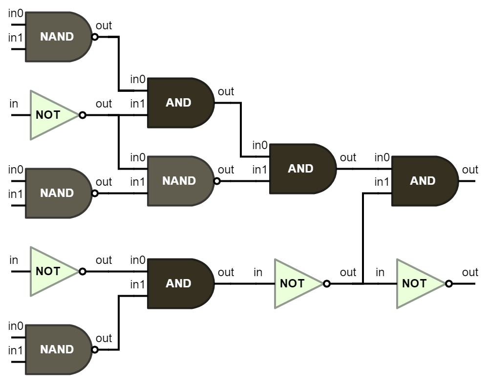 Graph Builder, Adjacency Graph Builder, and Tree Builder
In you want to generate and update yFiles graphs from your business data, our graph and tree builders are the perfect fit. By default, they directly connect the graph items found in the business data. However, if your data contains information about where exactly the edges should connect to the nodes, you can have a look at the three new “port-aware“ graph builder sample applications that demonstrate how the graph builder can be configured to support connections between specific ports of nodes.
Improvements for automatic layout
Curved Edge Routing
Both the Radial and Circular Layout now support curved edge routing and an integrated ray-like node labeling, facilitating more advanced and natural visualizations.
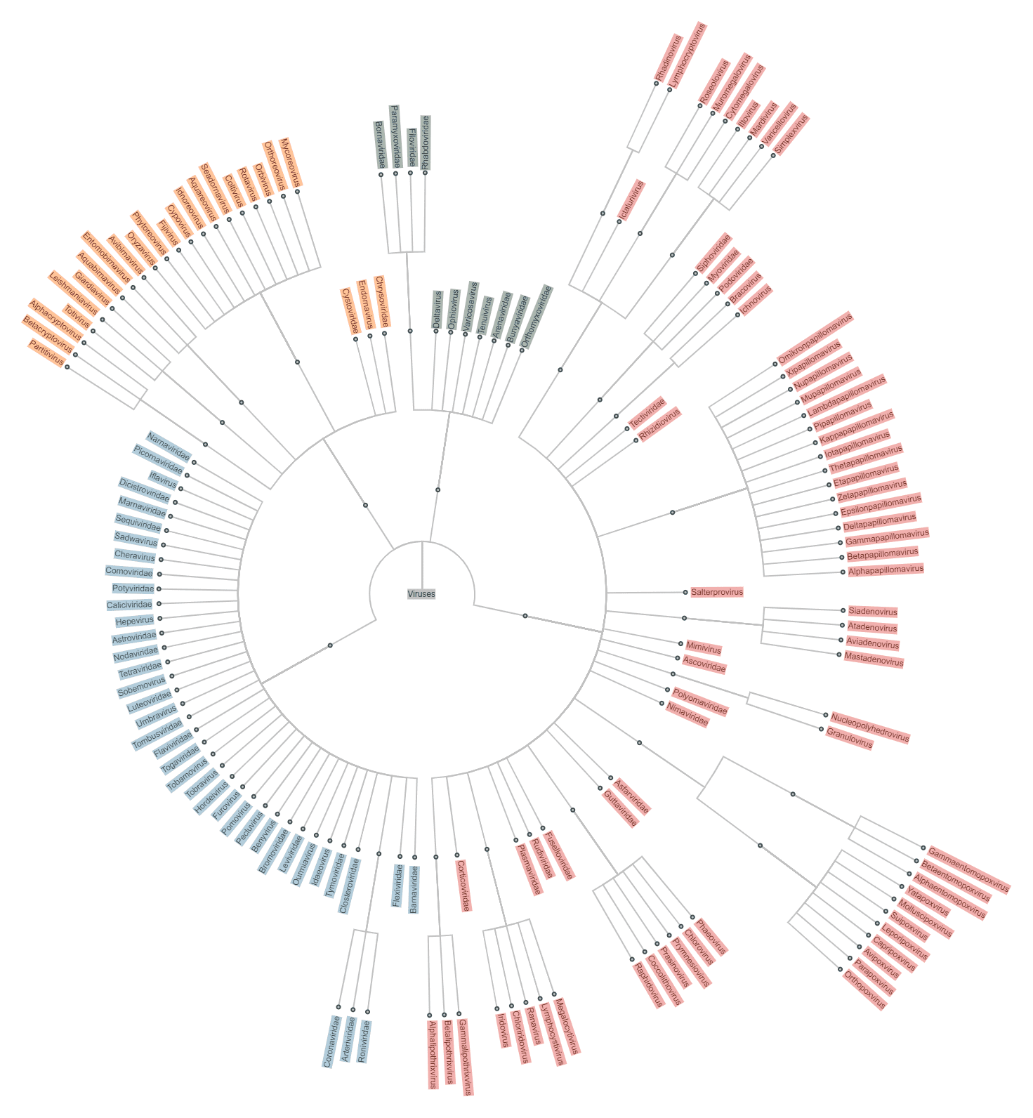
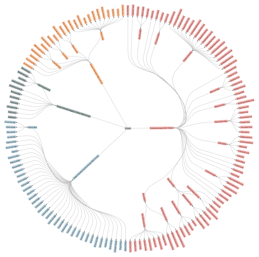
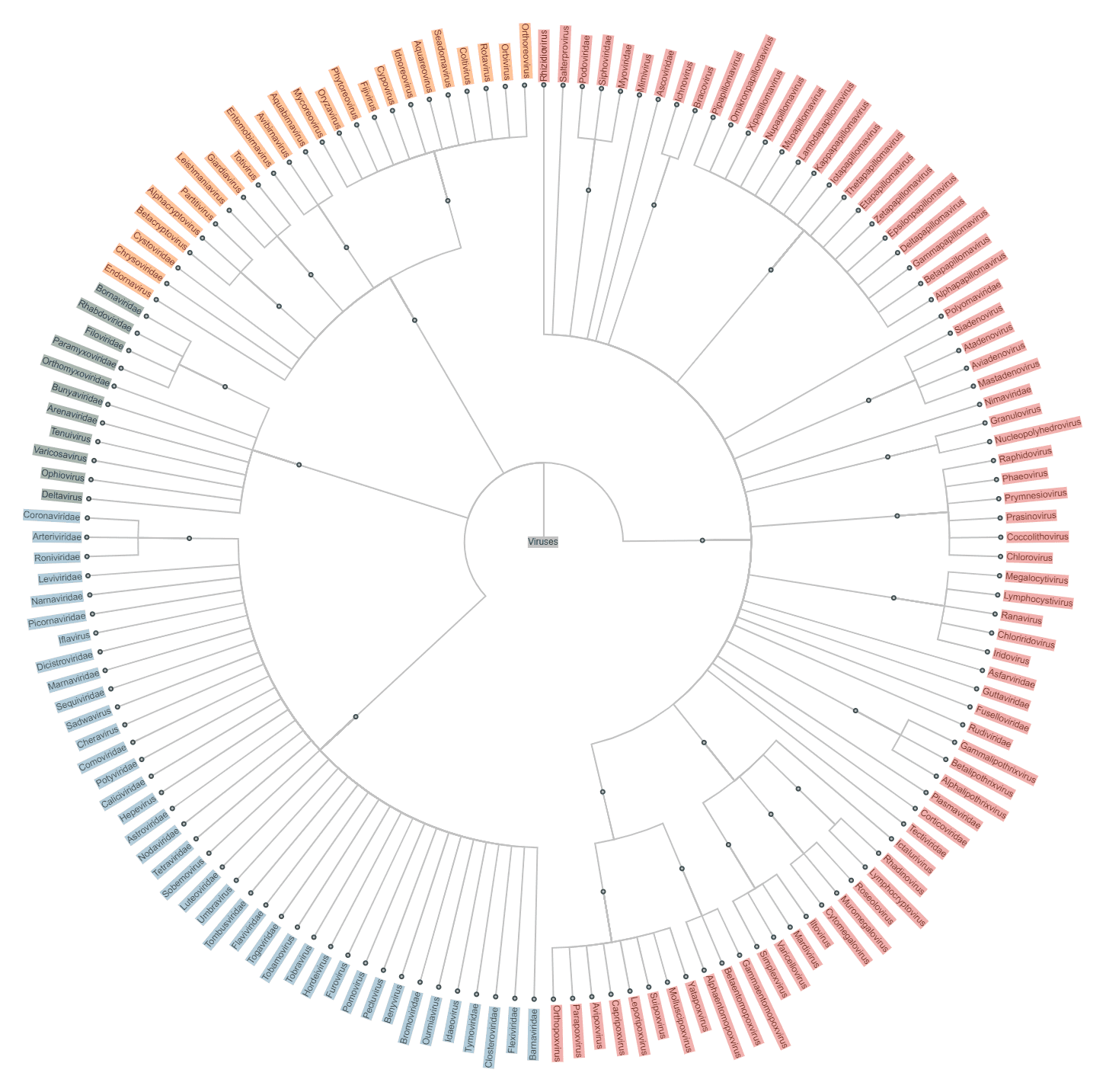
Dendrogram-like RadialLayout
We also added a new dendrogram-like style to the RadialLayout that always places the leaves of a tree on the outermost circle. This style is especially useful and common for specific tree structures like phylogenetic trees.
Tabular Sub-Structures in Hierarchic Layout
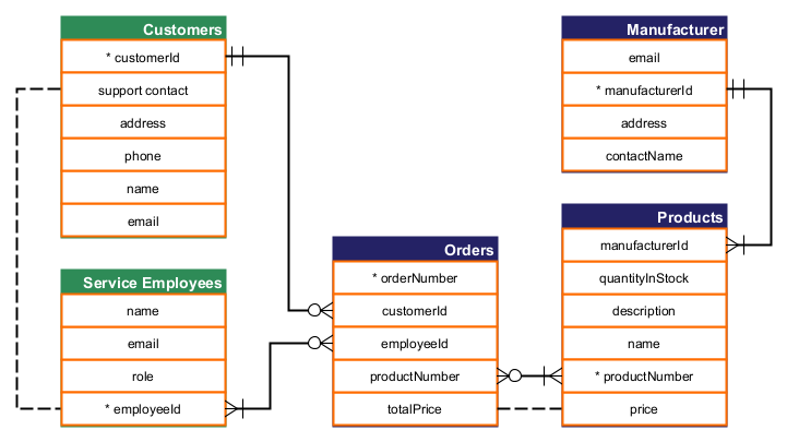
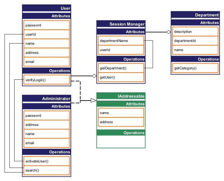
A frequent requirement of our customers is the support of tabular sub-structures, where some nodes represent compact tables containing multiple rows. Such structures can now be easily specified and handled by the Hierarchic Layout.
Some typical use cases for such structures are visualizing databases or class diagrams as below. Note that both layouts were calculated leveraging the new “tabular group“ feature of the Hierarchic Layout.
Versatile Subcomponents in Hierarchic Layout
We also improved the subcomponent handling of the Hierarchic Layout to better support a common use case where some nodes should be attached to the side of a node with the edges routed against the main drawing direction. As demonstrated in the example below, it now produces significantly better results for such cases.
Semantic Node Type Support for BalloonLayout
BalloonLayout now also offers node-type support. This allows for better recognition of elements of the same type by placing them closer to each other without affecting the overall layout style too much.
Compact Disk Layout Utility Layout

The new Compact Disk Layout arranges the nodes in a very dense disk without routing edges. It can be either applied to the whole graph or, more often, only to specific parts of the graph. The following examples use it for the entire graph, but a common use case is to apply it to specific substructures of an Organic or Circular Layout.
Tree Substructures in Organic Layout
We realized several improvements for the Organic Layout, which is always a good choice for visualizing larger networks, especially if they contain specific substructures. Besides the already supported substructures, the Organic Layout can now automatically detect tree substructures and arrange them with a tree layout. The user can choose the specific tree layout style.

In addition, the algorithm can now arrange the content of bottom-level groups in a compact disk-like style, which can be especially useful if the group content is disconnected from the remaining graph.
The disk-like style is now also available as an additional style for chain substructures.
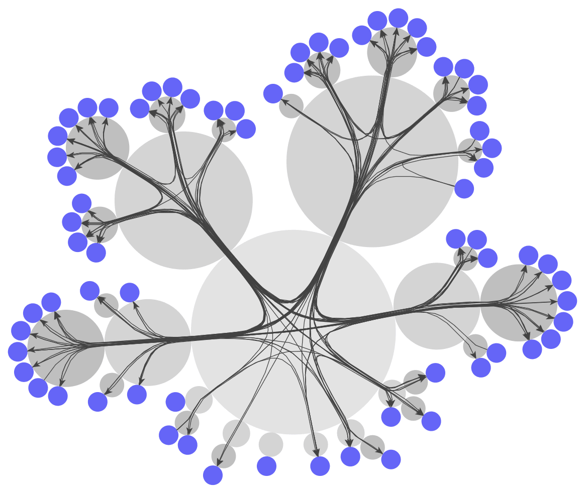
Cactus Group Layout
The new Cactus Group Layout allows an alternative representation of hierarchically nested data. It can be applied to both directed and undirected grouped graphs. Instead of visualizing the hierarchic parent-child relationships by drawing child elements within the parent box, like in traditional visualizations, it represents all nodes by circles such that the child circles touch the border of the respective parent circle. The subsequent examples show how this results in a cactus-like structure.
The algorithm can also visualize the inner nodes in a compact, folded fashion. All descendants of a “folded“ node are placed either at the border or within that node.
Try the new features yourself!
See the official yFiles for HTML release notes for more exhaustive list of the features we added to yFiles for HTML 2.5.
Most topics of this post are also covered in our webinar What’s new in yFiles 2022, which you can watch on YouTube:
Whether you're new to yFiles for HTML or want to try out the new version, we invite you to download yFiles for HTML, today!
And if you are interested in seeing some code, first, please do take a look at our GitHub repository which contains the TypeScript and modern EcmaScript sources for all the demos we provide.
As always: Happy diagramming with yFiles!


