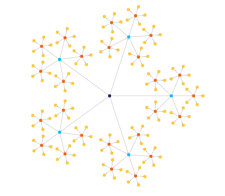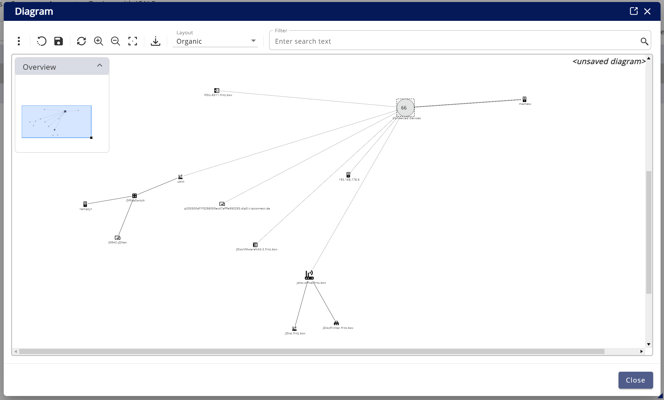
In today's digital era, businesses face the challenge of managing increasingly complex network infrastructures. Effective data visualization is crucial for understanding these intricate systems and making informed decisions. JDisc, a specialized software company, addresses this need by providing automated network discovery and documentation solutions. By integrating advanced data visualization techniques, JDisc enhances the clarity and comprehensibility of complex network relationships, thereby improving transparency and security.

JDisc automates network discovery through data visualization

JDisc is a specialized software company focusing on automated network discovery and documentation. With its main product, JDisc Discovery, it provides detailed and up-to-date network documentation, enabling IT departments to manage their infrastructure more efficiently. Clear and accurate visualization is essential for JDisc users. However, the challenge lies in the nature of the underlying data: networks are often large and highly complex. A purely static visualization of the entire network provides little value to users and can be difficult to interpret. To make these structures more accessible, an intelligent approach to visualization is required—one that dynamically adjusts to the user’s needs. JDisc continuously improves its visualization capabilities, including enhancements to its Web UI , which further improves the accessibility and usability of network diagrams.
Needs & objectives
Needs analysis
- Effectively visualizing large-scale networks while maintaining clarity.
- Reducing visual clutter without losing critical network details.
- Ensuring smooth navigation and usability in complex, highly connected structures.
- Improving troubleshooting by allowing users to focus on relevant network segments.
Objectives
- Providing an interactive collapsing mechanism for dynamic network exploration.
- Enabling targeted filtering and customizable views for different use cases.
- Supporting IT teams with structured, expandable diagrams for better decision-making.
The challenge of making large-scale network visualizations usable
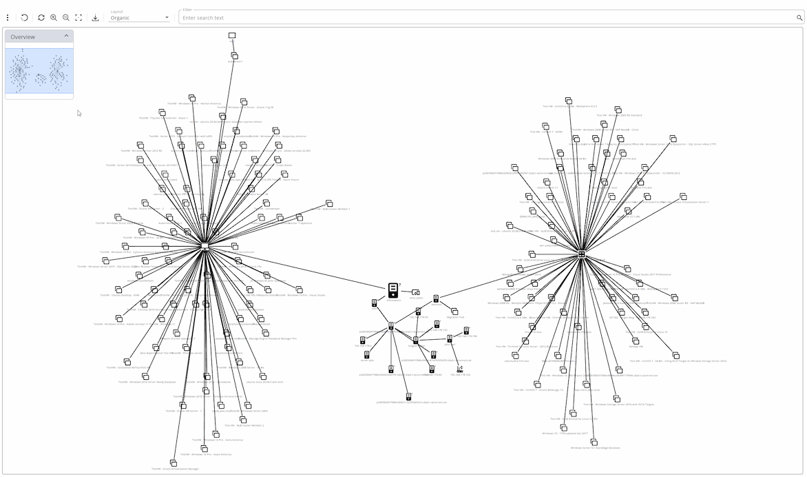
Large networks contain thousands of interconnected devices, making it difficult to create a visualization that is both comprehensive and easy to work with. A static representation may capture all the data, but it often fails to provide real usability— overwhelming users with complexity instead of helping them make sense of it. Without interactive features, network diagrams quickly become cluttered and impractical for day-to-day operations. Effective visualization must balance detail and clarity, allowing users to navigate, filter, and interact with the data intuitively. JDisc needed a solution that ensures network diagrams remain structured, actionable, and scalable, even as networks grow in size and complexity.
Techniques to address these challenges
Large-scale networks present a fundamental challenge: they must be visualized in a way that remains clear and usable, even as complexity increases. Without the right approach, network diagrams can quickly become overwhelming, making it difficult to identify key relationships and dependencies. To ensure readability and efficiency, visualization techniques need to provide structure, reduce unnecessary complexity, and allow users to interact dynamically with the data.
Several visualization techniques help reduce complexity while preserving essential information. These methods ensure that users can navigate large-scale networks efficiently and work with the data without being overwhelmed.
Collapsing
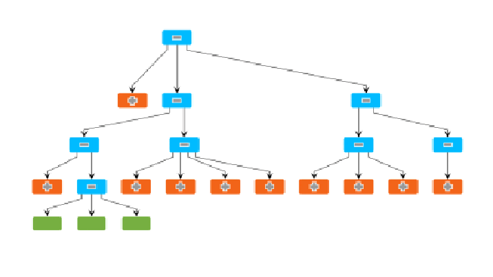
Collapsing allows users to simplify complex structures by representing as single nodes. This makes it easier to analyze specific parts of the network without distractions. Users can expand collapsed structures as needed to reveal details, ensuring that critical information remains accessible.
Grouping and folding
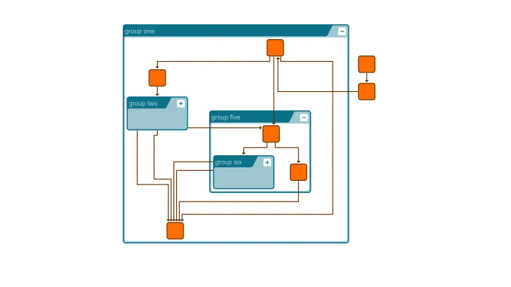
Similar or related nodes are combined into groups, reducing the overall complexity of the diagram. This "folding" mechanism makes hierarchical structures easier to navigate and provides a clear overview of the main relationships within the network.
yFiles Playground grouping & folding
Folding with layout demo
Filtering
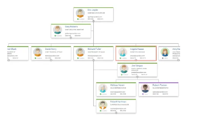
By applying filters, users can dynamically adjust the level of detail displayed in a network diagram. This technique allows them to focus on the most relevant nodes and connections while temporarily hiding less critical elements. Filtering enhances readability and improves troubleshooting efficiency.
Organization chart demo
Documentation: Filtering and hiding graph elements
Exploring subareas interactively
Users can isolate specific parts of the network and explore them interactively. This technique helps to gain deeper insights into specific areas without losing the overall context. By zooming into relevant subareas, users can better understand dependencies and make more informed decisions.
Network exploration through expanding and collapsing
The collapse functionality is a powerful tool for simplifying complex diagrams. By dynamically grouping and expanding nodes, it enhances readability and navigation while reducing visual clutter. This ensures that key relationships remain visible without overwhelming the user. By collapsing less relevant sections, users can focus on critical areas, displaying only the necessary information at any given time.
The ability to collapse and expand sections of a network is a game-changer:
- Improve readability by consolidating related nodes into single, expandable units.
- Navigate large diagrams with ease, focusing on relevant details while maintaining the overall context.
- Dynamically adapt layouts to keep diagrams structured and accessible as complexity increases.
Test and experience yFiles free of charge!

- Free support
- Fully functional
- 100+ source-code examples
How JDisc integrates the collapse feature of yFiles
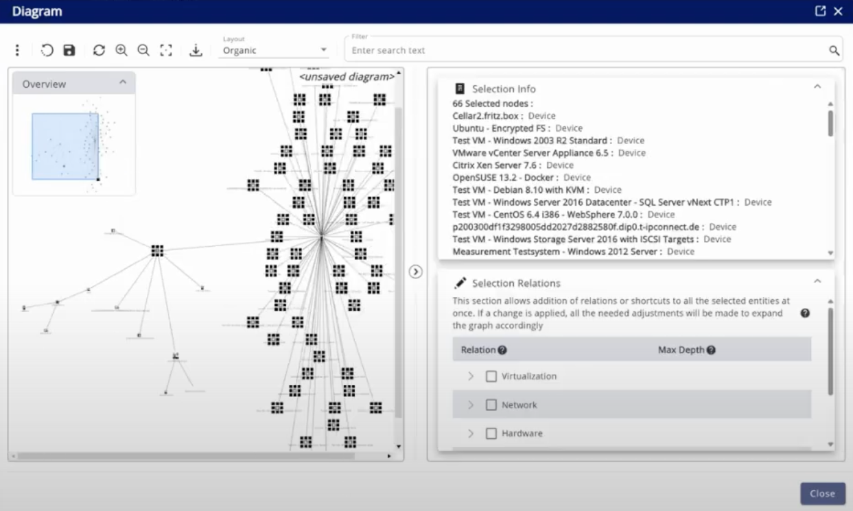
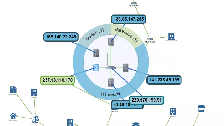
JDisc Discovery integrates yFiles’ visualization capabilities to enhance network exploration and management. The collapse functionality allows users to focus on relevant data without cluttering the interface. This effortless integration improves efficiency and decision-making by providing clear and actionable insights into complex IT environments.
In essence, despite the aforementioned challenges, by integrating yFIles, the performance gains have been significant:
- Faster network analysisIT teams can now navigate large infrastructures with reduced clutter, leading to quicker decision-making.
- Improved system responsivenessOptimized rendering techniques prevent lag, even with extensive datasets.
- Enhanced usabilityThe interactive visualization allows users to drill down into specific areas without losing overall context.
- Better scalabilityThe solution adapts to both small and large-scale networks, making it a long-term asset for IT management.
Implementing collapsing with yFiles in JDisc
JDisc leveraged yFiles’ built-in collapsing functionality to enhance their network visualization. The implementation involved several key steps:
- Defining group structuresNetwork nodes were analyzed to determine logical groupings based on device type, topology, or user-defined rules. These groups were structured hierarchically to allow dynamic collapsing and expansion.
- Configuring collapsing & expansion behaviorUsing yFiles' grouping and folding API, JDisc enabled users to collapse network segments into a single high-level node. Expanding a group restored its underlying structure, preserving all relationships.
- Integrating user interactionCustom UI controls allowed users to collapse or expand specific areas based on their needs. Visual cues, such as icons or animations, improved usability and clarity.
- Optimizing layouts for readabilityAfter collapsing or expanding a group, yFiles’ automatic layout algorithms ensured that the diagram remained structured and readable. Different layout strategies were tested to optimize visualization for large-scale networks.

JDisc enhances network visualization with yFiles

JDisc had already integrated yFiles into their application, benefiting from its flexibility and performance. When the need arose to improve the usability of large-scale network diagrams, they explored yFiles' built-in techniques for managing complexity.
Among the available options—collapsing, grouping & folding, filtering, and interactive exploration—JDisc identified collapsing as the ideal solution. It allowed users to dynamically group and expand elements, reducing visual clutter while preserving key relationships.
Since yFiles was already integrated into their application, JDisc could implement the enhancement seamlessly, without the need for extensive modifications. The result: a clearer, more efficient network visualization, enabling their users to work with large graphs more effectively.
The benefits of yFiles
With yFiles, JDisc developed a versatile graph visualization component that allows for interactive exploration of network relationships.
The following key features highlight how yFiles enabled them to build their product:

Conclusion
Managing large-scale network visualizations is a challenging task, but with the right tools, it becomes significantly more efficient. JDisc’s integration of yFiles allowed them to leverage advanced graph visualization techniques, ensuring their users can navigate complex network structures with ease.
By implementing collapsing, JDisc enhanced readability, reduced visual clutter, and maintained clear network relationships without losing essential details. This improvement has empowered IT teams to work more effectively, making network analysis and management more intuitive and productive.
As networks continue to grow in complexity, solutions like yFiles provide the adaptability needed to keep visualizations structured, interactive, and accessible. JDisc’s successful implementation of collapsing demonstrates how smart visualization techniques can turn overwhelming data into actionable insights.

About JDisc GmbH
At JDisc, we specialize in automated network discovery and documentation tools, providing IT organizations with highly detailed, up-to-date information about their IT environments. Our product suite gathers comprehensive hardware and software configurations from devices across networks and, crucially, uncovers the relationships between them. Whether identifying which device connects to a specific network switch port, discovering clustered devices, or pinpointing which virtual machines are hosted on physical servers, we ensure our customers have the full picture.
To further support IT teams, JDisc also offers specialized tools like its IP Scanner, which helps quickly identify active devices in a network.
While we store all this data and generate valuable reports, we recognized the need for a more intuitive way to visualize complex relationships. That’s where yWorks came into play. Their solution enabled us to integrate beautifully laid-out diagrams into our software, bringing our data relationships to life.
But it wasn’t just about static diagrams—we wanted interactive, dynamic diagrams that our users could actively engage with. With yWorks, we were able to offer features such as moving nodes, grouping related elements to simplify visuals, and using context menus on nodes and edges for deeper insights.
Thanks to yWorks, we successfully implemented our first set of diagrams within just three months of purchasing the product. While the investment might seem significant at first glance, it's undoubtedly worth every cent considering the quality, flexibility, and time savings it delivers.
We highly recommend yWorks to any company looking to enhance their data visualization capabilities with powerful, interactive diagrams.
jdisc.com
Learn more about JDisc’s IP Scanner for efficient network discovery.


